First, let’s check the density plots, to see how the data are grouped.
Show code
#read datascores <-read.csv2("scores80_11nov2024.csv")scores <-cbind(rownames(scores),scores[,1:4])samples <-c("Ppol_1"="TNB01", "Ppol_2"="TNB09","HB27_1"="TNB03", "HB27_2"="TNB07")names(scores) <-c("Genes",names(samples))scores[,2:5] <-lapply(scores[,2:5],as.numeric)scores$mean <-apply(scores[,2:5], 1, mean,na.rm=TRUE)#replace NAs for the mean#for (i in 2:5){# for (j in 1:nrow(scores)){# scores[j,i][is.na(scores[j,i])] <- scores[j,6]# }#}my.cols <-brewer.pal(5, "Paired")#density plotden <-ggplot(data=stack(scores[,2:6]))+geom_density(aes(x=as.numeric(values),fill=ind,color=ind), alpha=0.4)+scale_color_manual(values=c(my.cols)) +scale_fill_manual(values=c(my.cols)) +geom_vline(aes(xintercept=-0.65), color="grey", linetype="dashed")+geom_vline(aes(xintercept=0.55), color="orange", linetype="dashed") +xlab("Z-scores") +theme_bw()+ylab("Gene density")+guides(alpha="none",color="none")+labs(fill="Sample")#Histhist <-ggplot(data=stack(scores[,2:5]))+geom_histogram(aes(x=as.numeric(values),fill=ind,color=ind, alpha=0.2),binwidth=0.2)+scale_color_manual(values=c(my.cols)) +scale_fill_manual(values=c(my.cols)) +# scale_color_brewer(palette="Paired") + scale_fill_brewer(palette="Paired")+ geom_vline(aes(xintercept=-0.65), color="grey", linetype="dashed")+geom_vline(aes(xintercept=0.55),color="orange", linetype="dashed") +xlab("Z-scores") +facet_grid(~ind) +theme_bw()+ylab("Gene count")+guides(alpha="none",color="none")+labs(fill="Sample")ggarrange(den, hist, labels =c("A", "B"), ncol=1,nrow =2)
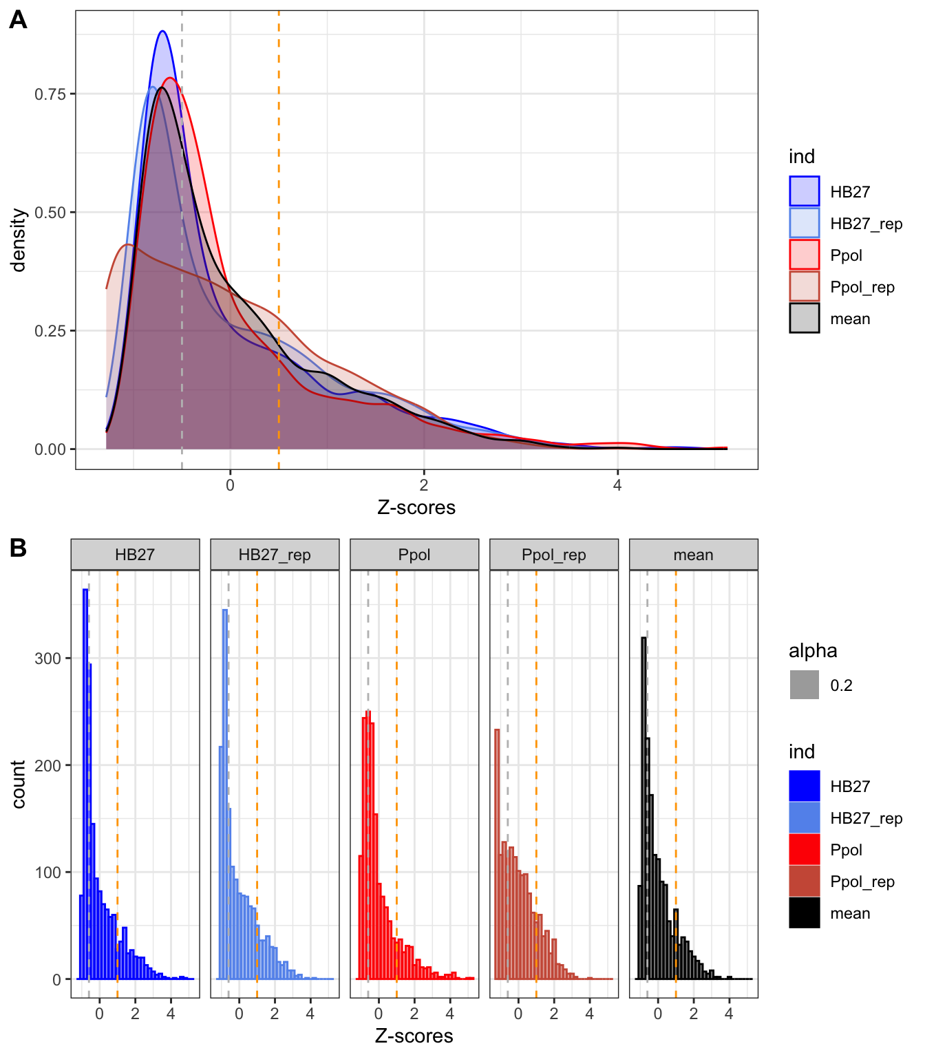
Figure 9. Distribution of Z-scores in density (A) and histogram (B) plots.
Show code
ggsave("fig2b_new.svg",hist,width=6,height=3.6)
Consistent with Figure 8, we can see that most genes are clustered at a Z-score <0, with a peak around -0.5 (grey line) and a shoulder centered at 1 (orange line). This indicates that most genes have a low number of insertions and that there is a gradient of genes up to a very high number of insertions.
In previous bacteria, the TnSeq data follow a bimodal distribution consisting of an exponential distribution of essential genes and a gamma family curve for the non-essential genes, with an inflection point in between (Goodall et al. 2018.; Moule et al. 2014; Valentino et al. 2014; Higgins et al. 2020; Ramsey et al. 2020; A. Ghomi et al. 2024), even in polyploid bacteria (Rubin et al. 2015). However, there is no inflection point in our data, so we confirm that there are no clear groups of essential/non-essential genes and only a gamma distribution can be fitted (p-value 2x10-16).
To make an approximate classification of the genes, we will perform an unsupervised cluster analysis. A similar approach was also used in a recent work (A. Ghomi et al. 2024), using DBSCAN algorithm. However, in that work they also have bimodal curve and more clear density separation of the score index. With our data, we obtained two large groups with wide range of overlapping index that was no very informative.
Show code
cl<-dbscan(scores[,c(2:5)],eps=0.65,MinPts =200)
Warning in dbscan(scores[, c(2:5)], eps = 0.65, MinPts = 200): converting
argument MinPts (fpc) to minPts (dbscan)!
Warning: A numeric `legend.position` argument in `theme()` was deprecated in ggplot2
3.5.0.
ℹ Please use the `legend.position.inside` argument of `theme()` instead.
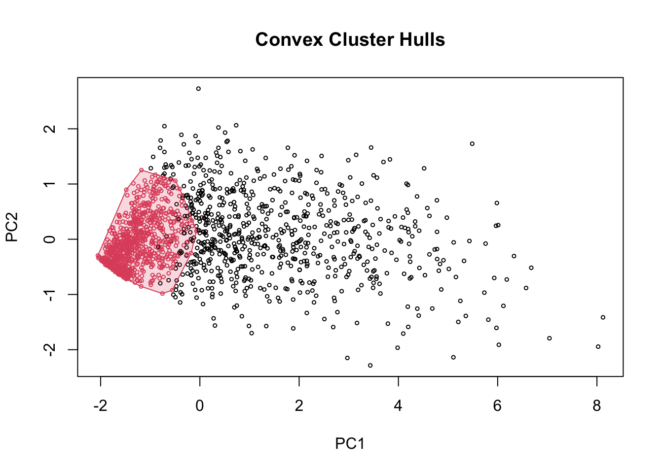
Figure 11. DBSCAN clustering results
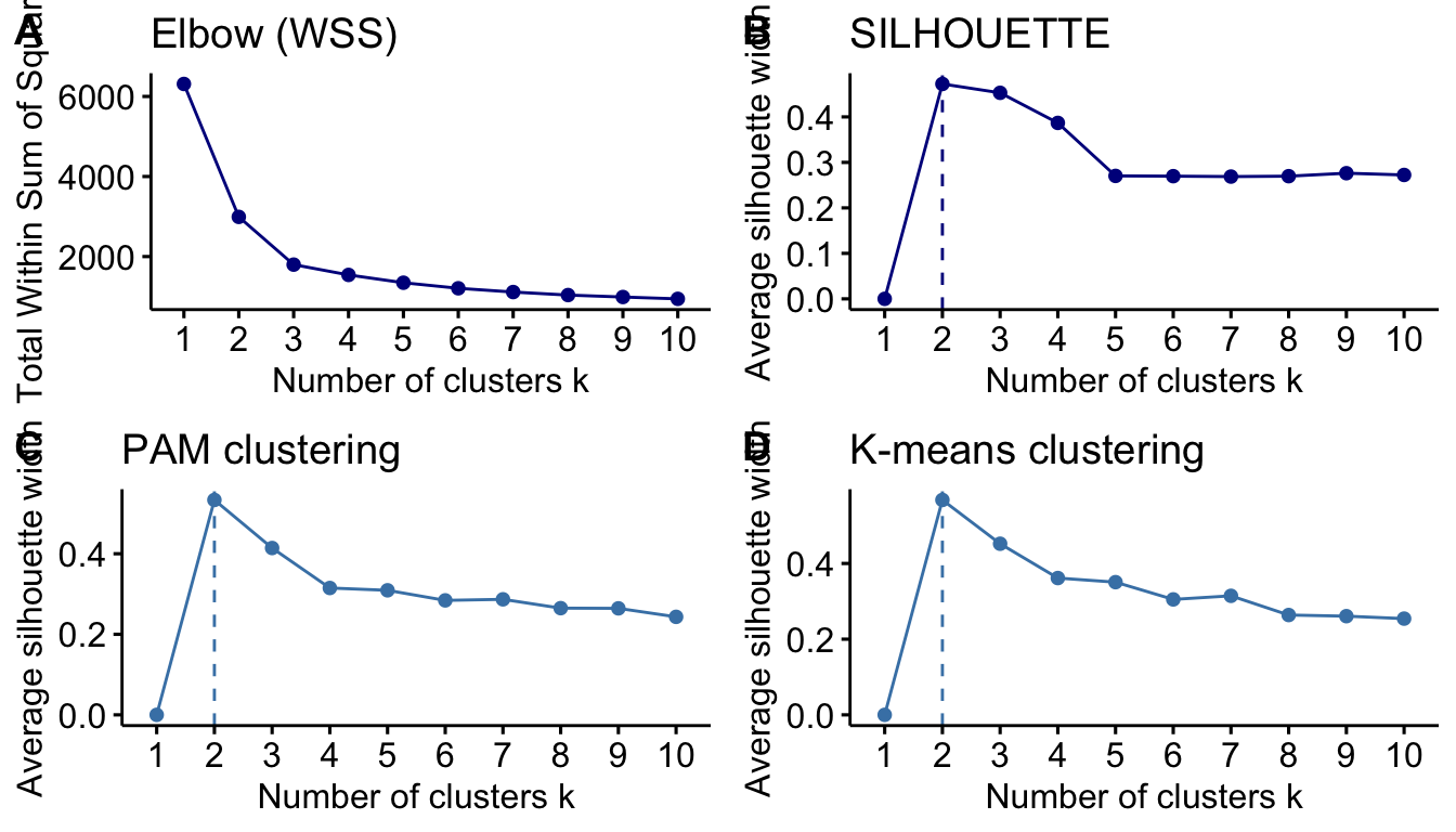
Thus, we decided to use a more classical approach and compare K-means and PAM clustering. First, we will test the number of clusters that allow us to better classify the genes.
Figure 12. Determination of best number of clusters for the TnSeq data, using the elbow (A) or silhouette (B) method. Panels (C) and (D) show the number of clusters by PAM and K-means, respectively.)
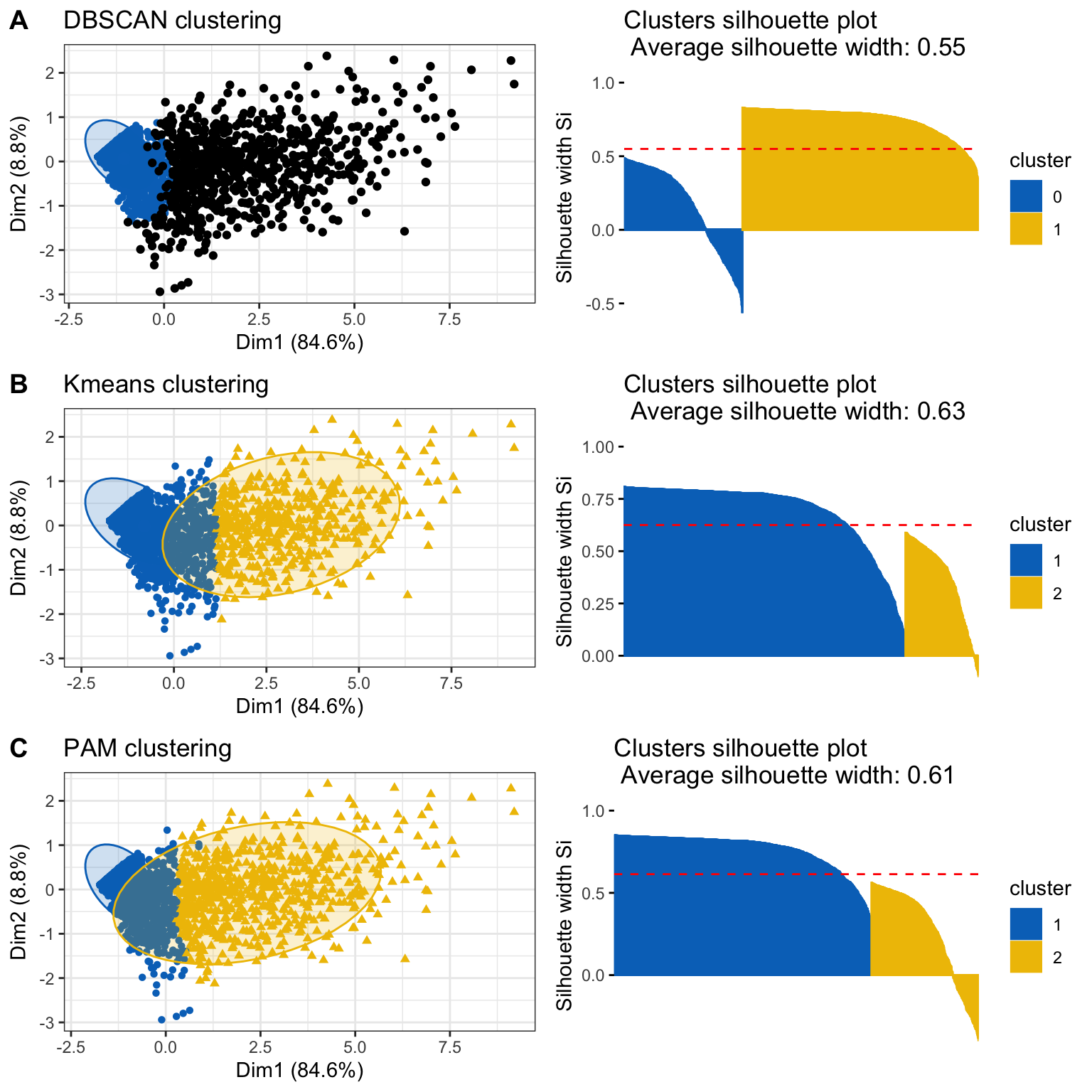
Now, we will compare all the clustering methods, DBSCAN and K-means and PAM with two clusters. We will select the method that yield a higher average silhouette value.
Figure 13. Comparison of clustering method. Cluster results and silhouette plots for DBSCAN (A), K-Means (B) and PAM (C) clustering method are shown.
The Kmeans clustering is slightly better as its clusters area are closer to the silhouette mean, thus we will keep this clusters and name them as “Highly Permissive” and “Intermediate” genes. As shown in the following plot, both groups are well separated.
Show code
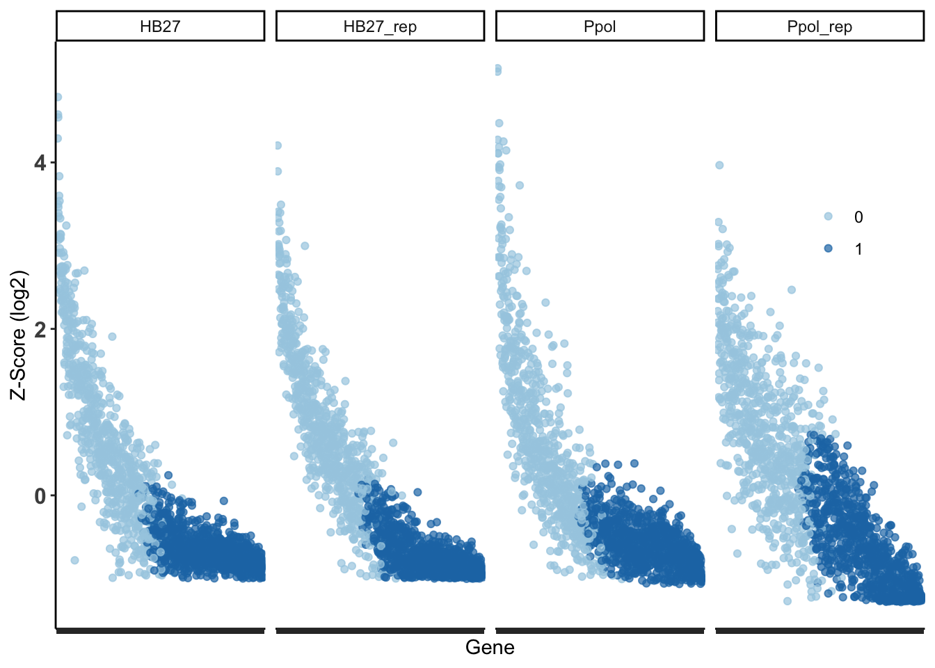
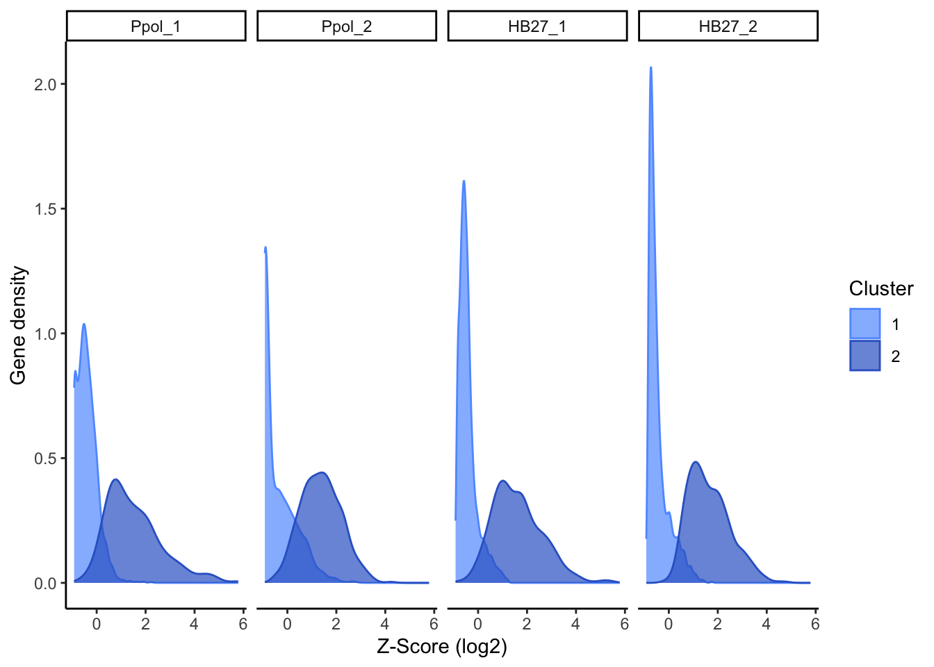
#full table#subset the ~10% genes with less insertionsdatos.j =cbind(scores, cluster= kmclust2$cluster)ggplot(data=cbind(datos.j$cluster,stack(datos.j[,2:5]))) +xlab("Z-Score (log2)") +ylab("Gene density") +geom_density(aes(x=as.numeric(values),group=as.factor(`datos.j$cluster`), color=as.factor(`datos.j$cluster`), fill=as.factor(`datos.j$cluster`)), alpha=0.7)+scale_fill_manual(values=c( "#619CFF" ,"#3366CC"))+scale_color_manual(values=c( "#619CFF" ,"#3366CC"))+theme_classic() +facet_grid(~ind) +labs(fill="Cluster",color="Cluster")
Figure 14. Density plot of genes by cluster in each sample.
The first group contains the genes with higher Z-score mean and the second large group contains the genes with less insertions. To highlight the top genes with less insertions, we empirically select the top 20% genes with less insertions as “Less Permissive” genes, corresponding to 0 genes with a Z-score < -0.6. This subset is an artificial creation within the “Intermediate” cluster, not distinctly separate from it (Figure 16), but useful for data representation and discussion.
Warning: There was 1 warning in `mutate()`.
ℹ In argument: `across(...)`.
Caused by warning:
! The `...` argument of `across()` is deprecated as of dplyr 1.1.0.
Supply arguments directly to `.fns` through an anonymous function instead.

  # Previously
  across(a:b, mean, na.rm = TRUE)

  # Now
  across(a:b, \(x) mean(x, na.rm = TRUE))
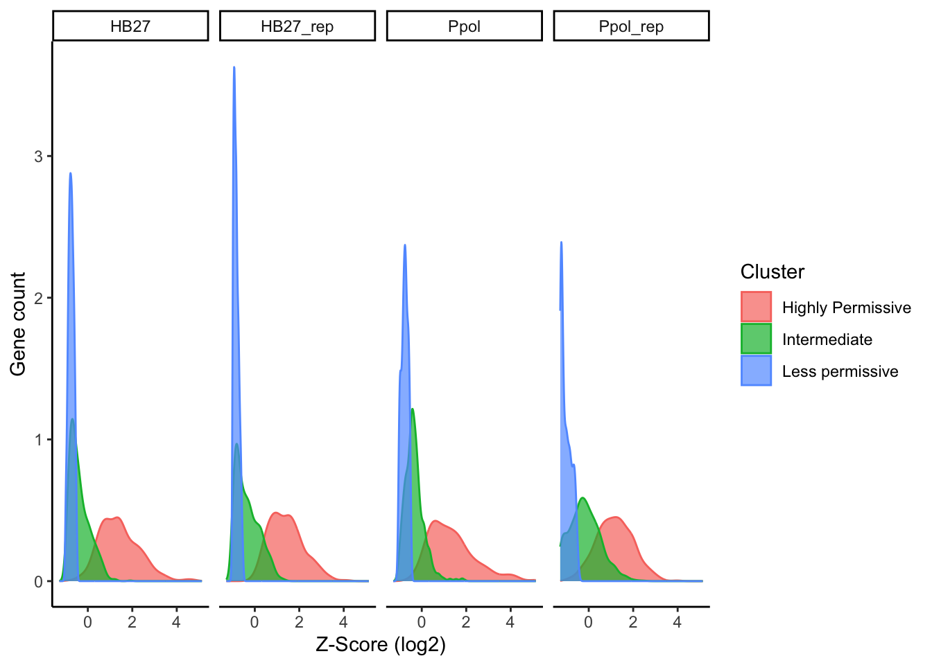
The separation between the “Intermediate” and “Highly Permissive” cluster is not very clear, as expected. Thus, for some analysis, we will consider these groups as only one same cluster. The following table contain the genes Z-score and classification in three groups.
Figure 16. Plot of Tn insertion Z-scores per gene and group. Density plot in all samples (A) and mean values (B). Values were sorted by the average of all samples.
Comparing WT vs Ppol strains
Although there is overall no differences between strains, we are going to check in detail if there is any gene with statistically significant more/less Tn insertions.
Show code
#meethod from https://lashlock.github.io/compbio/R_presentation.html#we need to use raw counts as integers, no Z-scores and only complete casescountData <-read.csv('tnseq_dd_counts_scores_all.csv', header =TRUE, sep =";")countData <-na.omit(countData[,c(1,7,9,11,13)])countData[,2:5] <-lapply(countData[,2:5], as.integer)metaData <-data.frame(names(countData[,2:5]),c("Ppol","Ppol","HB27","HB27"),c("Exp1","Exp2","Exp1","Exp2"))names(metaData) <-c("Sample","Strain","Experiment")dds <-DESeqDataSetFromMatrix(countData=countData, colData=metaData, design=~Strain, tidy =TRUE)
Warning in DESeqDataSet(se, design = design, ignoreRank): some variables in
design formula are characters, converting to factors
Show code
dds <-DESeq(dds)
estimating size factors
estimating dispersions
gene-wise dispersion estimates
mean-dispersion relationship
-- note: fitType='parametric', but the dispersion trend was not well captured by the
   function: y = a/x + b, and a local regression fit was automatically substituted.
   specify fitType='local' or 'mean' to avoid this message next time.
final dispersion estimates
fitting model and testing
Show code
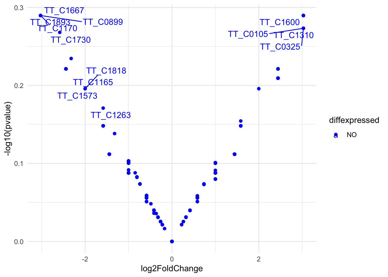
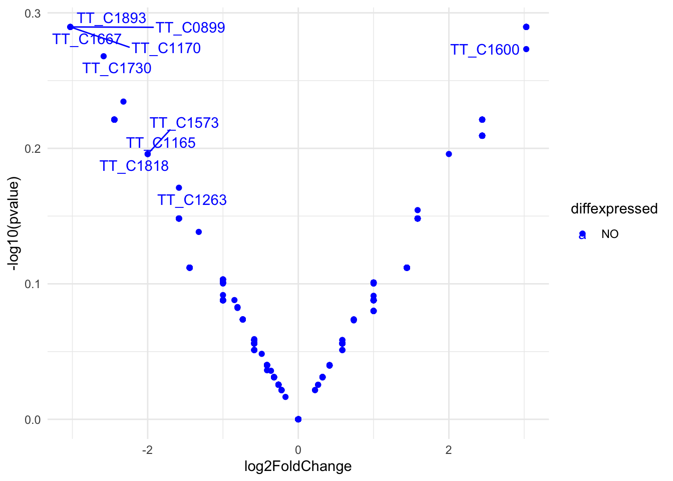
res <-results(dds)res <- res[order(res$padj),]res$diffexpressed <-"NO"res$diffexpressed[res$log2FoldChange >2& res$padj <0.01] <-"UP"res$diffexpressed[res$log2FoldChange <-2& res$padj <0.01] <-"DOWN"library(ggrepel)# plot adding up all layers we have seen so farggplot(data=res, aes(x=log2FoldChange, y=-log10(pvalue), col=diffexpressed, label=row.names(res))) +geom_point() +theme_minimal() +geom_text_repel() +scale_color_manual(values=c("blue", "black", "red")) #+
Warning: Removed 1315 rows containing missing values or values outside the scale range
(`geom_point()`).
Warning: Removed 1315 rows containing missing values or values outside the scale range
(`geom_text_repel()`).
Warning: ggrepel: 935 unlabeled data points (too many overlaps). Consider
increasing max.overlaps
Figure 17. Volcano plot of differential Tn5 target genes in HB27 vs. Ppol strains (fold change >4, p.adj<0.01).
As we can see there are genes with significant differences between samples.
Genes functional classification
COG
Show code
nog <-read_xlsx("00_raw/refs/MM_x4qgl_mt.emapper.annotations.xlsx",sheet=1,skip=2)nog$seed_ortholog <-gsub("262724.","",nog$seed_ortholog)names(nog)[2] <-"Genes"
After calculating the Z-scores, we are going to group the genes by their functions, using COG and KEGG functional categories. Functional annotation was obtained at EggNog mapper website Cantalapiedra et al. (2021). We could annotate 2006 (92.4%) of the HB27 proteins.
Show code
#load COG listcog <-read.table("scripts/cog_list.csv",sep=";",header=TRUE)cog <- cog[-26,]#summarize and split categoriescategories <-c()for (i in1:nrow(cog)){ categories <-grep(cog$category[i],nog$COG_category) cog$sum[i] <-length(categories)}#plot freqsggplot(cog,aes(y=as.numeric(sum), x=definition,color=group,fill=group)) +geom_bar(stat="identity", position="stack", alpha=0.8) +ylab("Number of genes") +xlab("") +coord_flip() +scale_y_continuous(breaks =seq(0, 500, by =100))+theme_classic() +theme(text=element_text(size=15),legend.text=element_text(size=9))
Figure 18. COG groups annotated in HB27 genes
After the incorporation of COG and KEGG annotations, the final TnSeq table is exported as tnSeq_dd_full.csv.
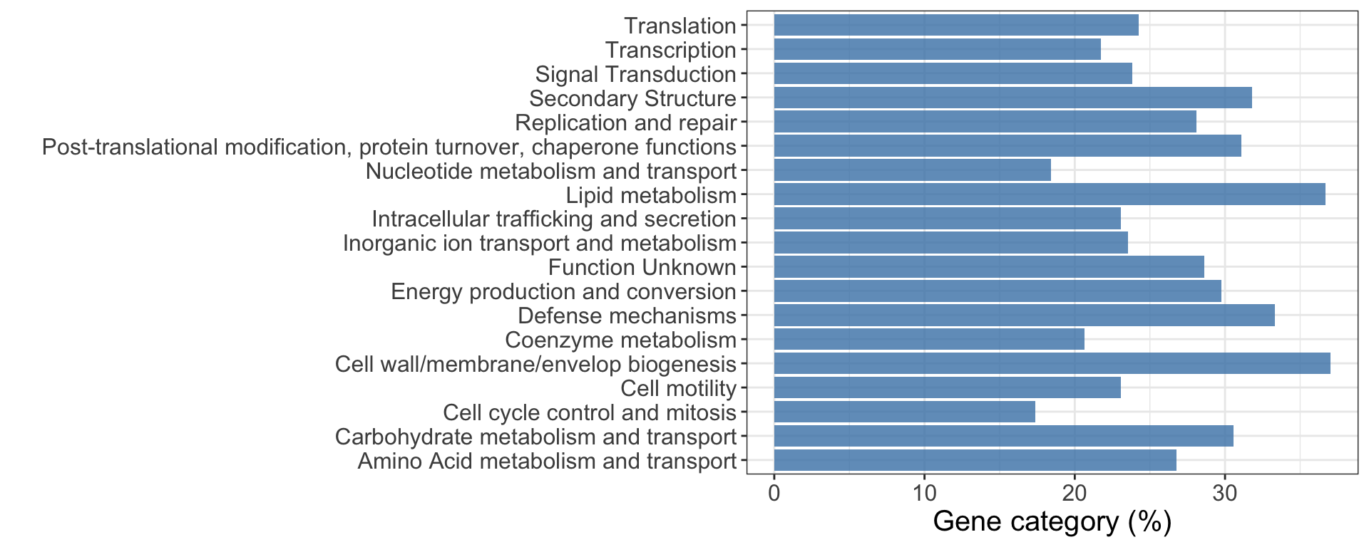
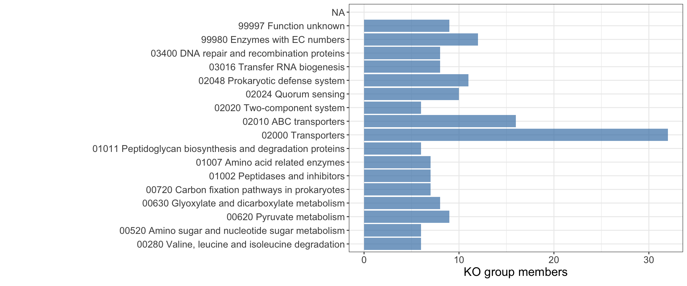
Figure 21. Abundance of Less Permissive genes amongst COG functions
Show code
#ggsave("figs5b.pdf",width=9,height=4)
KEGG
EggNog mapper could assign KEGG Ontology (KO) group to 1352 (62.28%) of the HB27 proteins. After revision of the KO annotation, we manually incorporated several missing tRNA genes to improve the statistics, using K14228 (tRNA-leu).
Show code
#parse data and countko <-fread("scripts/ko.csv",sep=";",header=TRUE)trna <-read.csv2("scripts/tRNAs.csv",header =FALSE)final$KEGG_ko <-gsub("ko:","",final$KEGG_ko)#tRNAs annotation is not very good, so we corrected for statistics#all tRNAs not annotated were masked as K14228 (tRNA-leu)final$KEGG_ko[final$Genes %in% trna$V1] <-"K14228"duplicate_ko_rows <-function(data) { data %>%mutate(reaction_ko =strsplit(KEGG_ko, ",")) %>%# Split ko annotationsunnest(reaction_ko) %>%# Unnest each annotation into separate rowsselect(-KEGG_ko) # Keep original columns except split annotations}datos_unnested <-duplicate_ko_rows(final)stats <-summarise(group_by(datos_unnested,reaction_ko,cluster),count =n())
`summarise()` has grouped output by 'reaction_ko'. You can override using the
`.groups` argument.
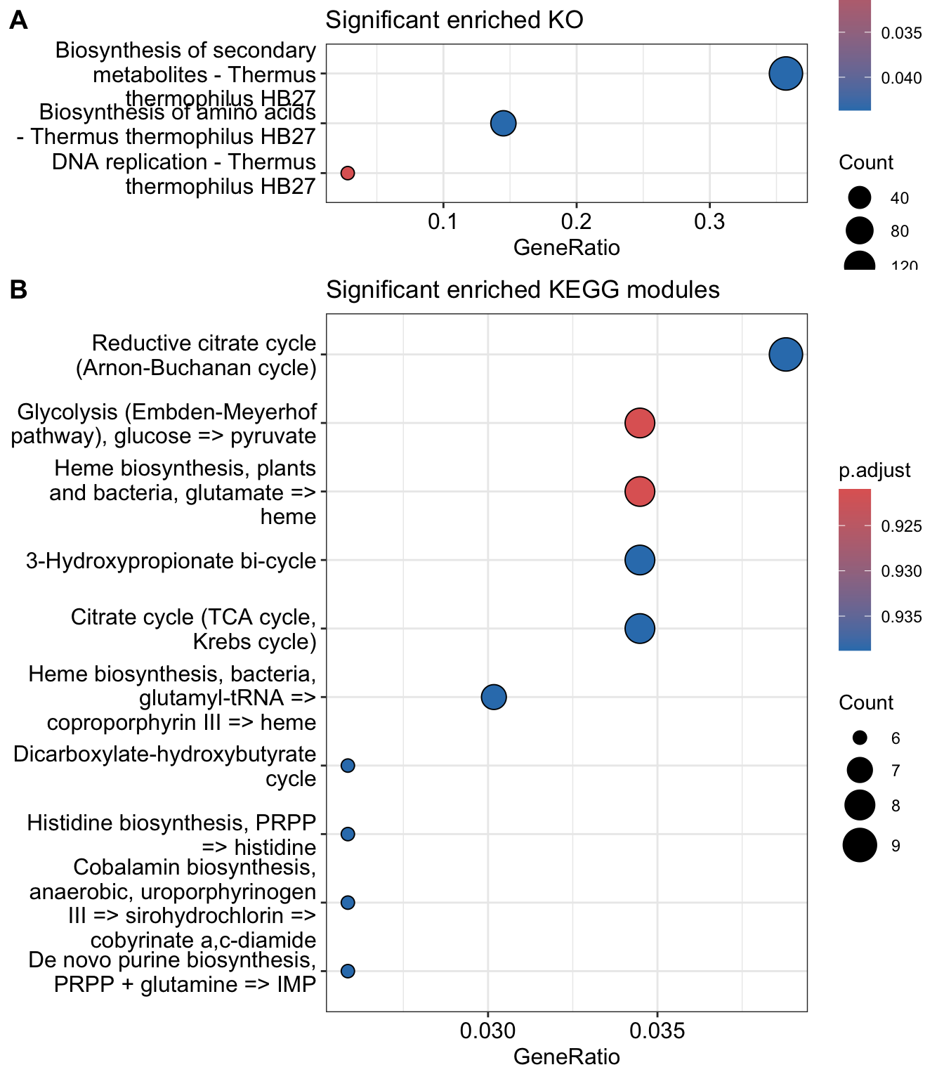
if (sum(mkk@result$p.adjust<0.05)!=0){p2 <-dotplot(mkk, title="Significant enriched KEGG modules")}else { p2 <-c()}p1
Figure 24. Significantly enriched KEGG Ontology groups made up of Less Permissive genes by KEGG ontology groups. There is no enriched KEGG module in this group
A. Ghomi, Fatemeh, Jakob J. Jung, Gemma C. Langridge, Amy K. Cain, Christine J. Boinett, Moataz Abd El Ghany, Derek J. Pickard, et al. 2024. “High-Throughput Transposon Mutagenesis in the Family Enterobacteriaceae Reveals Core Essential Genes and Rapid Turnover of Essentiality.”mBio 0 (0): e01798–24. https://doi.org/10.1128/mbio.01798-24.
Cantalapiedra, Carlos P., Ana Hernández-Plaza, Ivica Letunic, Peer Bork, and Jaime Huerta-Cepas. 2021. “eggNOG-mapper v2: Functional Annotation, Orthology Assignments, and Domain Prediction at the Metagenomic Scale.”Molecular Biology and Evolution 38 (12): 5825–29. https://doi.org/10.1093/molbev/msab293.
Goodall, Emily C. A., Ashley Robinson, Iain G. Johnston, Sara Jabbari, Keith A. Turner, Adam F. Cunningham, Peter A. Lund, Jeffrey A. Cole, and Ian R. Henderson. 2018. “The Essential Genome of Escherichia Coli k-12.”mBio 9 (1): 10.1128/mbio.02096–17. https://doi.org/10.1128/mbio.02096-17.
Higgins, Steven, Stefano Gualdi, Marta Pinto-Carbó, and Leo Eberl. 2020. “Copper Resistance Genes of Burkholderia Cenocepacia H111 Identified by Transposon Sequencing.”Environmental Microbiology Reports 12 (2): 241–49. https://doi.org/10.1111/1758-2229.12828.
Moule, Madeleine G., Claudia M. Hemsley, Qihui Seet, José Afonso Guerra-Assunção, Jiali Lim, Mitali Sarkar-Tyson, Taane G. Clark, et al. 2014. “Genome-wide saturation mutagenesis of Burkholderia pseudomallei K96243 predicts essential genes and novel targets for antimicrobial development.”mBio 5 (1): e00926–00913. https://doi.org/10.1128/mBio.00926-13.
Ramsey, Kathryn M., Hannah E. Ledvina, Tenayaann M. Tresko, Jamie M. Wandzilak, Catherine A. Tower, Thomas Tallo, Caroline E. Schramm, et al. 2020. “Tn-Seq reveals hidden complexity in the utilization of host-derived glutathione in Francisella tularensis.”PLoS pathogens 16 (6): e1008566. https://doi.org/10.1371/journal.ppat.1008566.
Rubin, Benjamin E., Kelly M. Wetmore, Morgan N. Price, Spencer Diamond, Ryan K. Shultzaberger, Laura C. Lowe, Genevieve Curtin, Adam P. Arkin, Adam Deutschbauer, and Susan S. Golden. 2015. “The Essential Gene Set of a Photosynthetic Organism.”Proceedings of the National Academy of Sciences of the United States of America 112 (48): E6634–43. https://doi.org/10.1073/pnas.1519220112.
Valentino, Michael D., Lucy Foulston, Ama Sadaka, Veronica N. Kos, Regis A. Villet, John Santa Maria, David W. Lazinski, et al. 2014. “Genes contributing to Staphylococcus aureus fitness in abscess- and infection-related ecologies.”mBio 5 (5): e01729–01714. https://doi.org/10.1128/mBio.01729-14.